
Before elaborating on my poster presentation «Oranges Are the New Statistics», which I gave at the United States Conference on Teaching Statistics (USCOTS) 2019, I would like to give huge thanks to all USCOTS-ers who stopped by during the session, for your enthusiastic reception!
The 150 word abstract for «Oranges Are the New Statistics» was:
An orange peeling contest is a nice and juicy trick to use when teaching different data types and corresponding descriptive statistics at introductory level.
Start by telling them about James Lind and the world’s first randomized, controlled trial, before all students guess the number of wedges in a general orange, its weight, and the peeling time. Then, every student gets an orange, weighs it, you conduct a speed peeling contest, and count the number of wedges.
Summarise the data by descriptive statistics of discrete and continuous data, and discuss the correct choices of descriptives. Further discussions depend on the age of the students. Some possible questions include “When are data discrete or continuous?” “When should we use mean (and SD) or median (and quartiles)?”, and “What happens with the summary measures if each student peeled several oranges?”
Feedback from participants from the age of seven years have been constantly positive.

However, as USCOTS participants know by now, it is hard to fit all your thoughts in a five-minute talk, and even harder to express every facet of your teaching idea in a maximum of 150 words. Which is why I have written this blog post. Get ready for the orange elaboration!
For this activity, you need:
– I orange per participant
– At least 1 kitchen weight (I have several)
– Cleaning paper
– On-screen stop watch
– Board/flip-over/pad for handwriting, or
A pre-specified google-sheet and a pre-specified R-script

Paragraph 1: Why bother organizing an orange speed-peeling contest?
Short answer: Because it is a fun and engaging way to collect your own data.

And:
Because orange-weighing, orange-peeling and orange-carpel-(yes, it is the correct English word for the orange wedges)-counting give you different data types for illustrating descriptive statistics:
Weighing oranges will give symmetrically distributed continuous data. (By the way: When will it not?) The peeling times are also continuous data – often symmetrical (if the peelers are old enough) – but sometimes skewed (if some of the peelers are inexperienced or very young). Finally, the wedge counts are discrete data.
This simple data set will serve perfectly as an example for the illustration of basic descriptive concepts and basic statistical notation. And the students know and understand every part of the data collection.
Besides, the «experiment» is tactile, looks nice, smells good, is full of vitamin C, and you get to eat your research material.
Paragraph 2: James Lind, who?
James Lind from Edinburgh joined the British Royal Navy as a surgeon’s mate in the late 1730s. Out there, sailing the high seas, he could observe the effects of scurvy at first hand, and he is recognized as the person conducting the world’s first randomized, controlled trial. He randomized n=12 sailors into, not two groups, but six(!), and found out that lime juice was the way to treat the illness. This was the very first origin of the American slang nickname for a British person. Read more here.

Paragraph 2: Why make the students guess the observations?
Because scientists always do. We always have some expectations, some guess, or some a priori knowledge which we can adjust by collecting data, (...!! – oh my! This activity can even be done in a Bayesian introductory course!! I haven’t even thought of that before! Oh my, oh my! That would have been awesome! But I don’t teach Bayesian statistics (yet). Who volunteers to try in their class?!) OK, where was I… erm… yes,
Making the students guess and/or discuss their guesses make the participants engage even more in their own data collection. By guessing, they will not only have to think actively on what they expect, they will also immediately have a second competition going on: Will my guess be correct? This is, however, a pretty harmless competition, since the observations vary and there will be many possibilities of getting the right answer.

Guessing
Photo: Alfred Akinsete
Eating
Photo: Alfred Akinsete
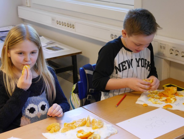
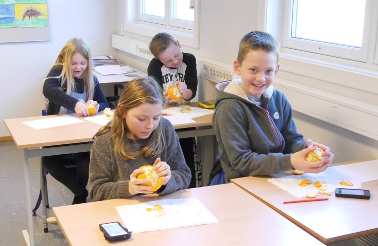
Paragraph 2: Ready…weigh! Ready…PEEL! Ready…count!
Now, every student gets an orange, weighs it, writes down the number for the orange weight, and wait for the others to get ready. While waiting: Did you get what you expected?
Then there is the common speed peeling contest: «Ready… PEEL!«, with a stop watch on a large screen. Were you as fast as you thought you would be?
And finally, everybody counts the number of wedges in their orange. Compare it with your guess.
Make sure you communicate these instructions clearly before the participants pick up their orange. If not, chaos is sure to break loose. And make sure you have garbage bins and piles of cleaning paper available. If not, there will be more chaos. (Not to be confused with CAOS.)
Paragraph 3: The statistical learning goal
At this point, your students have the data at hand, all sticky fingers, the room smells intensely of oranges, you see happy faces all around you, everybody can eat their own research observations, and you can cover whatever statistical topics you find appropriate.
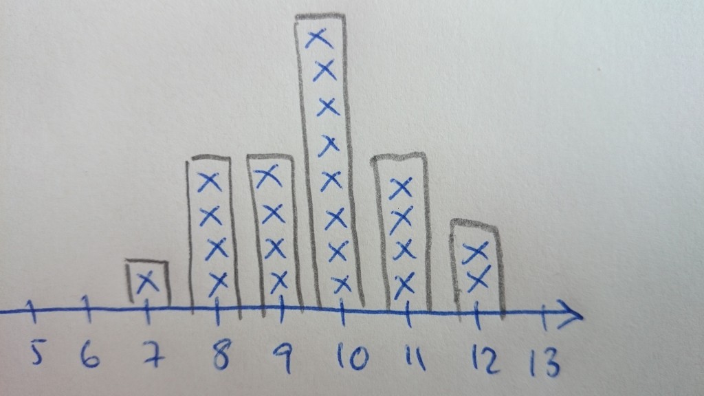
If your audience is a class of 7-year-olds, it may be more than enough to summarize the number of wedges in a bar chart (maybe you can use lines of oranges on the floor to illustrate the height of the bars) and identify the most common count. (Maybe you could also acknowledge that the weights and the peeling times vary.)

If your audience is a introductory class in statistics (at any level): Summarise the data by descriptive statistics of discrete and continuous data, introduce the statistical notation you think is applicable and/or necessary, and discuss the correct choices of descriptives.
Further discussions depend on the age of the students and the curriculum of the course. Some possible questions include “When are data discrete or continuous?” “When should we use mean (and SD) or median (and quartiles)?”, and “What happens with the summary measures if each student peeled several oranges?”
Suggestions from the audience at USCOTS2019:
– Weigh the oranges after you have peeled them and analyse the difference or the peel-to-flesh ratio.
– Select a set of oranges, and do a follow-up study of their weights, with daily weighing.
– And, of course, the Bayesian idea which emerged while I was writing this post!

I think that the maybe greatest advantage about this activity is that it can be adapted to any type of audience and any age down to the age of seven. And that it can be expanded in any direction you like: Research design, statistical concepts, medical history, the accept and application of research findings in society, causality and interventions based on causal inference, sometimes even despite the lack of knowledge of the real causes of a disease, etc etc.
I have tried this out in several teaching/learning environments: In elementary schools (down to the age of 7-8 – younger children are not always able to peel an orange), at leisure time arrangements for children at in local libraries, at bachelor level statistics courses at university, among medical doctors taking a PhD, and in several events involving grown-ups; even knitting festivals and in a Norwegian grocery store chain management group. (Be aware, though, that particularly competitive participants, like the economic managers mentioned, may be so exited by the speed peeling setting that you need to take a break before you continue the seminar 😀 )
Hence, this is an activity that can occur both on its own, and it can also be a integrated pat of a statistics course curriculum.

At University level, my colleagues and I have also done data collection by web-based databases/google sheets,

Hilde Vinje talks about project-based teaching in statistics, while Jon Olav Vik prepares a script for the faculty orange-peeling session. 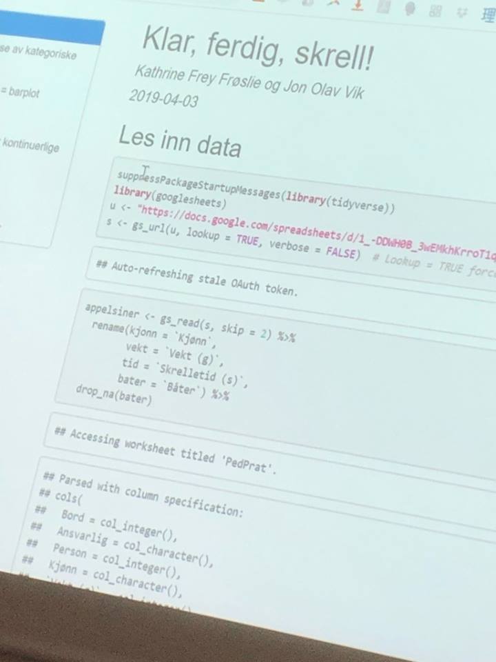
and I have also used the data to make exam exercises or in mandatory assessments for the students.
The following feedback on the original abstract came from one of the USCOTS reviewers, and I think it is so nicely written that I’ll just quote it, even though some of it has already been said, and some of it is not exactly what I had in mind – hopefully it can give you some other thoughts as well:
After collecting the data, we have several different types of data for summarizing the results. Students learn to summarize results using both discrete (bar charts, mode) and continuous (histograms, mean, median, standard deviation, quartiles) data. This allows for direct comparison between various methods of summarizing data and helps students consider when each method would be most appropriate.
A variety of classroom discussions can occur with this activity, including when data are considered discrete and continuous, when it is better to use the mean/SD and when it is better to use the median/quartiles, and even predictive questions such as what will happen to the summary measures if each student peeled several oranges.
This activity always receives positive feedback from participants and involves several different senses and teaching strategies, thus appealing to a variety of learning styles/methods. Poster attendees will receive inspiration and activity materials and will be able to engage in a discussion with the author of next steps for the activity, including potential for formal evaluation. Feedback encouraged!” (Note: this suggestion includes the “discussions” subheading as well). I am very excited to see your poster presentation!

Dear reviewer, I am not sure who you are, but thank you! And I hope you had a chance to be there. It was fun, you see! And having fun is when we learn best, isn’t it?
Fun facts:
In Norwegian, an orange is called «appelsin», which derives from «apple from China»
In Norwegian, an orange carpel/wedge is called «appelsinbåt», that is, «orange boat». Which makes sense:

I have made several files (pdf and ppt with instructions) available in Norwegian, and these will soon be translated and made available also in English.
What remains?
The theme of the conference was «EVALUATING EVIDENCE.» Despite positive response on my orange activity, I have no formal evaluation of its efficacy. So: Any suggestions of how I could evaluate the evidence for the perceived success would be highly appreciated. Feel free to leave a comment below, or send me an e-mail: kathrine.frey.froslie (at) nmbu.no
And: To the anonymous statistician eating an orange in the pictures above: I have not asked you for permission to use these pictures. If anyone who reads this could provide me with contact information, I will ask, and delete if desired.
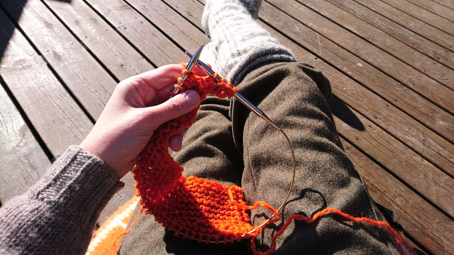
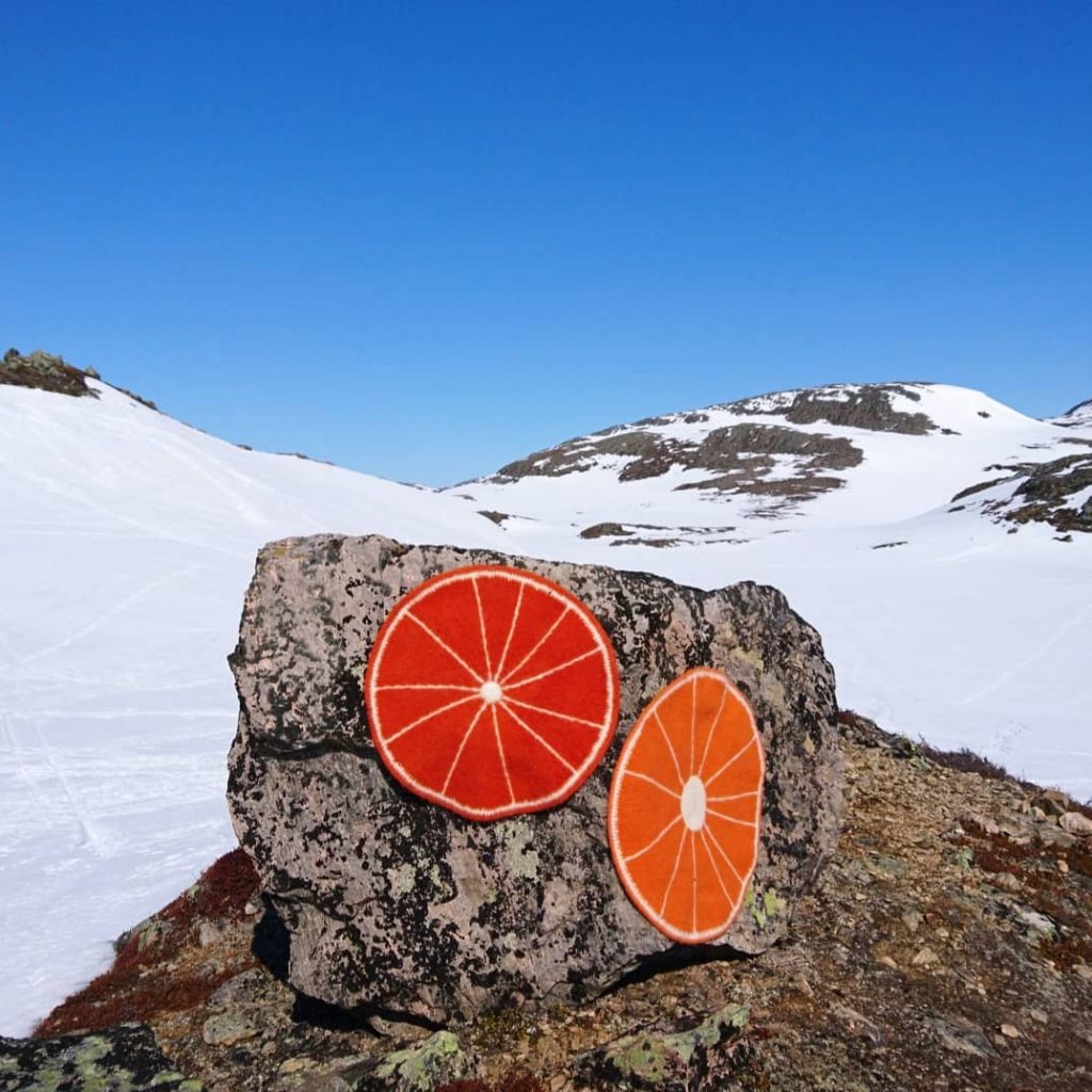
Appendix: Knitting your poster
Maybe you didn’t quite understand the connection to knitting?
You’re right, I have only explained the knitting part to some of you during USCOTS meals. These are facts:
1) I did knit my poster. And
2) knitting patterns are available for one of the large oranges and for all the small limeys in the poster presentation (in Norwegian, here and here).
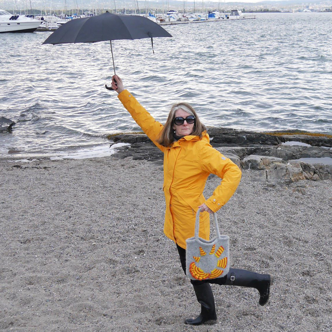
As you may have figured out, Statistrikk.no is a Norwegian statistics blog. And a knitting blog at the same time. You could say, «A statistics blog in sheep clothing». I call it «A popular science knitting blog».
But what does this really mean? To put it briefly: I believe that we must use every channel possible to get our statistical and research-based message across to people outside the scientific community. That includes using unorthodox presentation methods as we have also seen at USCOTS. Impro-theatre? Go for it! Sing your curriculum? Give it to me! Dance your PhD? Take it away! Teaching data science in creative writing classes? Yes, please!
I have chosen knitting as my medium.

That is, I choose a specific topic that I would like to communicate in a popular science way, and then I design a knitting project to either illustrate some fun facts (like the number of carpels in an orange), some facts (e.g. Mandate distribution after the last election in Norway), some essential statistics (e.g. Critical vaccine coverage for whooping cough), or the statistical concept itself (e.g. normal distribution scarf), and use the knitting pattern and corresponding pictures as clickbait for non-statisticians.
The name of the blog is a pun, and a mix of two Norwegian words:
Statistikk = «Statistics» and
Strikk = «To knit»
Merge these, and you get Stati-strikk, which is something like «Knitted statistics», but impossible to translate.
You may also compare this blog to a Trojan horse: I give the readers what they (think) they want, that is, the knitting patterns, in exchange for spending their time reading half a blog post about statistics… It’s a win-win!
As of today, the blog posts – including the knitting patterns – are in Norwegian only, but during the following days I will write a couple of posts in English in honour of the USCOTS2019.
If you would like to follow this sheepy Trojan horse as it leaps about, the easiest way is to like the Statistrikk facebook-page or follow Statistrikk at Instagram.


Loved it and will try it!!!
Awesome! Do it 😀